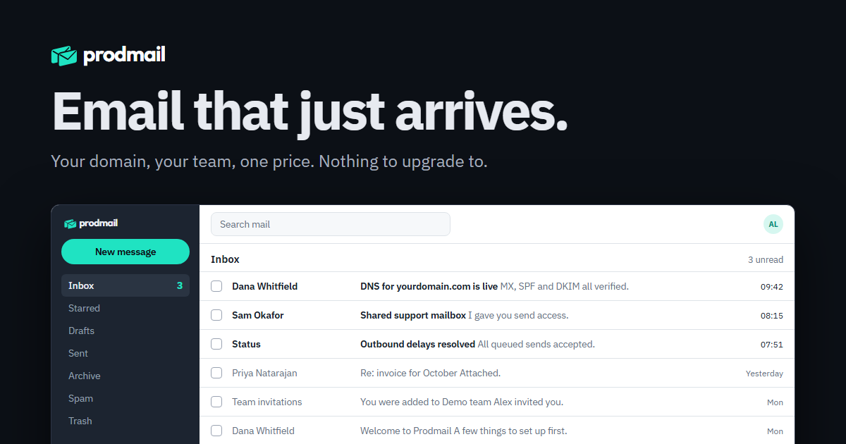
The visual system
Prodmail is a small, honest mail host. The identity is built to say that: one clear mark, one bright colour used sparingly, plain words set in a workmanlike typeface.
Say what it does.
Every screen and sentence names a concrete thing: a mailbox, a domain, a price. No "solutions", no "Pro".
Keep the lean.
The envelopes tilt 13° and overlap by a third. That geometry is the logo. Don't straighten it, flip it or separate the pair.
One mark, every surface.
The same mark sits in the webmail sidebar, the browser tab, the site header and the share card. The icon simplifies to one envelope, nothing else changes.
Logo variants
Use the lockup wherever there's room. The mark alone goes in tight spaces. The wordmark alone is for places the mark already appears nearby. SVGs are outlined, with no font dependency; white PNGs are transparent and need a dark background.







App icons
At icon sizes the twin envelopes turn to mush, so the icon is one envelope in ink on a teal tile. It's the browser favicon, the Apple touch icon and the store tile. Not transparent.














Clear space and minimums
Keep a quarter of the mark's height clear on every side of any logo. Nothing else sits in that zone.

| Lockup, minimum | 120 px wide on screen, 160 px preferred. 30 mm in print. |
| Mark, minimum | 20 px tall on screen, 24 px preferred. 6 mm in print. |
| Below that | use the app icon instead; it's drawn for 16 px. |
Do
- Use the supplied files; don't retype the wordmark.
- Teal mark with ink text on light, teal mark with white text on dark.
- Keep the 13° lean and the one-third overlap.
- Put it on flat colour or a quiet photo.
Don't
- Stretch, rotate, straighten or mirror it.
- Add shadows, gradients, outlines or glows.
- Recolour it outside this palette.
- Separate the envelopes or use one envelope as the logo (that's the icon only).
Colour
Dark surfaces and one bright teal. On white, the teal drops to a deeper shade so text and buttons stay readable. Click a swatch to copy its hex.
Status colours never carry meaning alone; pair them with a word or an icon. Labels in the webmail use their own small palette (green, amber, blue, red, teal, plum) so they stay distinct from the accent.
Typography, spacing, shape
Two typefaces with two jobs. Outfit Bold is the wordmark and nothing else. IBM Plex Sans is everything you read; IBM Plex Mono is everything you copy.
Outfit Bold, letter-spacing -0.035em, lowercase. Wordmark only.
IBM Plex Sans 400, 500, 600 and 700. Headlines tighten to -0.03em; body stays at 16px with 1.55 line height.
10 mx1.prodmail.io · v=spf1 include:_spf.prodmail.io -all
IBM Plex Mono for addresses, DNS records, identifiers and anything meant to be copied exactly.
| Display | 64–96px, 700, -0.035em, line height 1.0 |
| Page title | 40px, 600, -0.03em |
| Section | 30–34px, 600, -0.025em |
| Subhead | 18–20px, 600 |
| Body | 16px, 400, line height 1.55; 14.5px inside the app |
| Small | 13–14px, muted |
| Spacing | An 8px rhythm; 4px for tight UI gaps |
| Radii | 6px fields, 8px buttons and cards, 12px panels, pill for the primary action |
| Borders | 1px Line; no drop shadows on light surfaces except floating panels |
| Form | Repeat the lean: tilted elements and overlapping pairs are ours. Keep everything else square. |
Voice and naming
Plain, specific, a little dry. We say the price, we name the limit, and we never call anything "Pro".
| Rule | Example |
|---|---|
| Name | "Prodmail" in prose, capital P. The wordmark is lowercase "prodmail". Never ProdMail, Prod Mail or PRODMAIL. |
| Addresses | Always lowercase: alex@prodmail.io, help@prodmail.io. |
| Company | "Prodmail is a HODL Labs product." Legal: HODL LABS - FZCO. |
| Sentence case | Headings, buttons and labels: "Create account", not "Create Account". |
| Verbs on buttons | Say what happens: "Check records", "Sign in", "Delete forever". Not "Submit", "OK", "Go". |
| Claims | Only what's shipped and measured. "Opens in under a second" needs a number behind it. |
| Instead of | Say |
|---|---|
| Unlock premium features | Everything's included. It's $12 a year. |
| Oops! Something went wrong. | Couldn't save the draft. Check your connection and try again. |
| Your email, reimagined | Email that just arrives. |
| Seamless enterprise collaboration | Shared mailboxes with read, send and manage grants. |
| We take your privacy seriously | We don't read your mail. Here's exactly what we store. |
Downloads
Everything on this page in one zip, plus a CSS file with the tokens so a page can match the brand with one import.